 Your new post is loading...
Online merchants could always use some free expert advice from the design community. There is a wide variety of free ebooks available to help. Here is a list of helpful ebooks on design. There are titles on typography, classic design, color theory, user-experience design, logos, brand building, creativity, and more. All of these ebooks are free.
The logo is the most essential part of making any brand recognizable. Hiring a professional designer to create a custom logo can definitely be expensive, especially for most small business owners and individuals who don’t have the budget. Fortunately, there is a seemingly endless supply of Web-based solutions to help you create logos with relative ease - and these are some of our favorites. Once you're done, head on over to Logo Rank, an AI tool that critiques your new logo design. ...
Logo Crunch is a multi-resolution logo maker, it uses computer vision to make your high-res logo legible at lower resolutions. Use it for a website favicon, iOS app icon or Android app icon.
Many people believed that modern technology will first replace the low wage jobs from the industries that are dependent on manual labor rather than intellectual work. However, the latest innovations in robotics and A.I. tend to contradict our previous beliefs: we are now entering a new era, of A.I. based design that hopefully, will change everything for the best. Until recently, computer generated design was regarded more as a sci-fi idea rather than a reality. The development of artificial intelligence was focused on other goals and nobody could have dreamed about it being capable of actually delivering something useful to mankind. Sure, we all have at least once admired beautiful fractals generated by computers but let’s face it, they were not actually visual designs. They were visual math and nothing more.
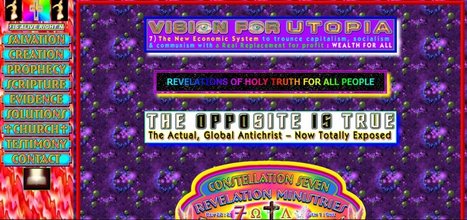
We may not judge a book by the cover, but we always judge a business by its website. This is the reality and we have to deal with it. Back in time, in the early days of the Internet, creating a website was something that only IT guys were capable of making. With today’s advancement of technology and increasing interest for better and easier solutions when designing websites, almost anyone can design websites without much effort or any coding know-how. Before listing the worst websites I have found on the Internet, let me be clear about some things: Firstly, I don’t mean to cause any trouble or pain to anyone, and I am certainly not making fun of web designers. Therefore, I beg the developers of the listed sites not to take offense at my remarks. I am quite sure some of these sites are designed by beginner designers. We all have to start somewhere. Besides, mistakes easily occur if you don’t have any experience.
Websites that are considered as modern and fresh today, will not be treated in the same manner tomorrow because Web design trends are changing constantly with time. Professionals associated with the industry are aware of the fact that every year brings new challenges and opportunities in the field of web design and development. Therefore, it is important to know how to make them flexible and adaptive towards the rapidly changing trends of website design. Here, we have put together a list of web design trends that will have a bigger impact in 2018....
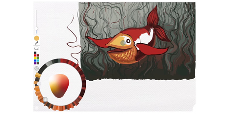
While many imaging apps’ tools closely resemble those used by artists in the real world – such as brushes and pens – the color picker feels like a completely digital device. A new project from the folks at Adobe Research and University of Toronto reimagines it as a skeuomorphic palette that’s designed to be more natural and intuitive, while allowing for the creation of harmonious color schemes and works of art. Instead of forcing users to choose from colors from across the entire spectrum, Playful Palette presents you with an interface that’s more like how you’d mix paint in real life. Pick a bunch of colors represented as paint blobs, make a puddle with them, blend them with lighter and darker hues by pushing in different directions and get a gradient of colors to work with. Hit ‘play’ on the clip for a better idea of what I’m talking about:...
Patterns for the people, by the people
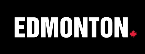
It's all in caps and punctuated with a small maple leaf at the end. And it only took three years to develop. "This is our one-word brand," said Brad Ferguson, president and CEO of the Edmonton Economic Development Corporation, as he presented a picture of the so-called wordmark to city councillors Tuesday. The wordmark is one piece of the redevelopment of Edmonton's overall image, brand and reputation that EEDC has been working on for years. It will be used to promote the city to an international audience. ...
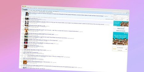
If you’ve been on the Web in the past decade, you’ll likely have visited Reddit, Craigslist, Wikipedia, 4Chan, Hacker News, or The Drudge Report at some point. While these sites are all vastly different, they have two things in common: they’re all extremely popular among their audiences and they all look, well, terrible. Web technologies have come so far in the past few years and designers now have a vast array of tools and techniques at their disposal. Yet these sites feature unflattering layouts that have no connection to the modern design philosophies seen around the Web today. Craigslist’s current design is lacking, to say the least. Why do some of these sites look like they were built in the 90s? Where are the clean layouts, carefully selected fonts and complementary colors? For the record, The Drudge Report and Craigslist are indeed more than 20 years old — both were launched in 1995. Wikipedia just turned 15 last month. Reddit has now been around for 10 years, while image board 4chan is going on 13....
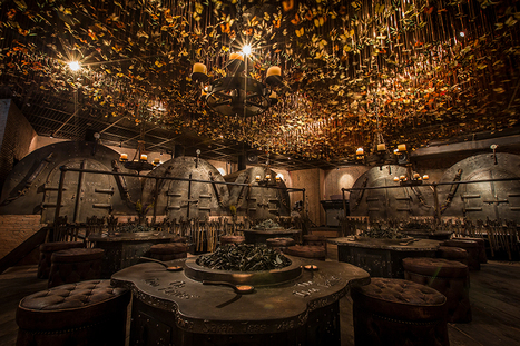
Named ‘the iron fairies’, the mysterious interiors of this bar conjures up scenes from a fairytale book or Lord of the Rings. With three locations: Bangkok, Hong Kong and Tokyo, the underground den is reminiscent of a blacksmith’s workshop; reflected in the iron, timber and leather materiality and the curious decorations all across the eclectic interior. Created by designer Ashley Sutton, a distinctive element of the iron fairies is the ceiling enveloped with 10,000 preserved butterflies that suspend over the main ‘workshop’ room furnished with low seating and circular tables. Rooms branch out to form individually designed ‘furnaces’ and ‘casting rooms’, offering private spaces for smaller groups. The element of enchantment is distilled into every detail of the bar interior, with the concept itself deriving from sutton’s days working in the underground iron-ore mines in Western Australia. With this, the décor follows a fantasy imagined by the designer where ore miners stumble upon little winged spirits, mixing roughly hewn wood, massive rusty cogs, rickety piping, and walls lined with vials of fairy dust....
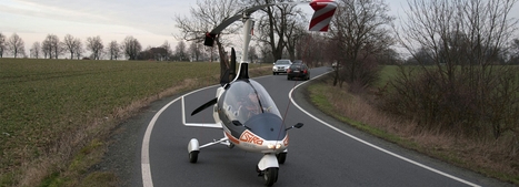
Flying cars have proved this year that they are far from just a science fiction concept, but the winner of the race to become street legal is Autogyro, a Czech helicopter company whose ‘gyrodrive’ vehicle has now been officially authorized to travel both road and sky. The unique vehicle is more a ‘copter than a car, yet has been modified to be able to be driven on the public road. the car has been developed by Pavel Brezina, a pilot who has been in the industry for 30 years. The two-seater vehicle can reach up to 25 mph on the ground, but once it takes to the air the gyrodrive can speed along at 110 mph.
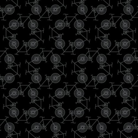
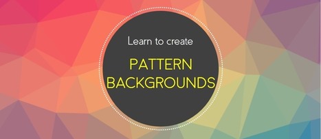
Free pattern backgrounds that you can create yourself in PowerPoint. Use geometric pattern background and abstract pattern backgrounds for amazing designs!
Via Baiba Svenca
|
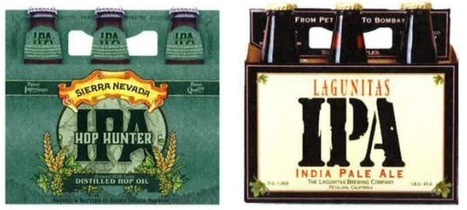
Ten years ago, a lot of breweries found they could get away with soliciting a friend to design their beer packaging. Not anymore.
With so many beers competing for attention on the shelves, standout beer labels have become a critical part of any brewery's marketing strategy.
So which breweries have come up with those really standout designs?
In 2009, I started a stock media company with a single vision: to provide premium creative content that everyone could afford. This idea grew into VideoBlocks, followed by the launch of GraphicStock and AudioBlocks. Now, we’re adding millions of photos to our new image Marketplace and it’s time to bring our expanding libraries together as Storyblocks.
In this list we're sharing some of our favorite websites that offer free resources for presentation design such as templates, icons, images, fonts and more.
Via Baiba Svenca
Daily Design Inspiration from selecting photography, architecture, graphic design and more. Our goal is to simply inspire your day and be creative!
During my stint working for a newspaper, I recall their simple design philosophy: Big, bold text headlines on a white background. As we well know, the web is a totally different animal than print. But many principles of good design are applicable to both mediums. The use of large headline text is one of them. Typography on the web has changed a lot over the past decade or so. Whereas we used to have just a few basic fonts to choose from, we now have more than enough options to satisfy our appetites for beautiful, attention-grabbing headlines. Unlike that newspaper (which generally used one font for its headlines), web designers are exercising their creative freedom to use different types of fonts. Some are using the more traditional bold, serif and sans-serif fonts while others take advantage of more modern styles and weights. Let’s take a look at how designers are utilizing large headlines to convey a message. Most don’t apply to news, per se – they’re more about branding. But, as you’ll see, there is more than one way to successfully approach them....
This article is the third in a series devoted to the understanding of minimalism in web design. During the time, this trend has become very popular among the graphic designers and it will still be on top for the years that will come, regardless the influences it will have. You might assume minimalism is easy – after all, fewer elements mean less work, right? In fact, the opposite is more accurate. Because you are restricted to a usage of few elements, they must be chosen and used with care and thoroughness, having a specific purpose as a starting point. If it’s done properly, minimalist design can be a stunning masterpiece, in terms of UI, visual design, UX and conveying your message to the users. Minimalism works because it does what all design should do – it puts the emphasis on content....
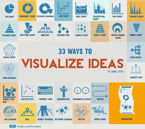
So how do you visualize your ideas? Your old standby bar graphs and pie charts are just the tip of the iceberg — it’s not uncommon now to see executives and professionals of all stripes working on visuals instead of hunkering down at the keyboard for a long session of pecking away in Word. The people over at Funders & Founders shared this interesting infographic recently, with 33 different ways to visualize your ideas. Unleash your inner creative and challenge yourself to try one of these visual formats the next time you need to pitch your idea to a colleague or client....
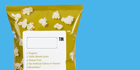
Brandless, a company which can best be described as an online hybrid of Trader Joe’s and Ikea’s kitchen section, just raised a $35m Series B to be the “Procter & Gamble for millennials.”
Their site launched yesterday, and is already selling everything from colanders to quinoa puffs — all for a flat fee of $3 per item.
And they’re doing it all without a “brand”…or are they?
Fighting the “false narrative” of consumption
Created in 2016 by entrepreneur Ido Leffler and Sherpa Capital partner, Tina Sharkey, Brandless has raised almost $50m thus far on the bet that younger consumers don’t care as much about brands as big CPG companies would like investors to believe....
Dr. Gitte Lindgaard at Carleton University wanted to find the answer to that question, so she ran a study. She flashed web pages in front of users for 1/20th of a second. Then she had the participants rate the web pages they saw.First impressions are formed in milliseconds. Her research pointed to something amazing: customers form first impressions about marketing in as little as 50 milliseconds. 50 milliseconds. Customers make judgments about marketing before they’ve even had a chance to process what it’s trying to convey. There’s no cognitive effort involved in this first impression; it’s completely visual and based almost entirely on emotion and feeling....
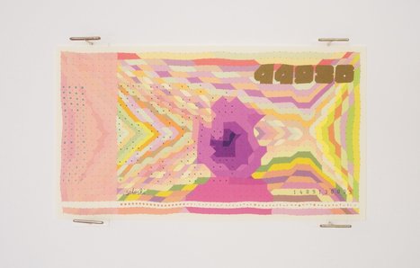
Bitcoin isn’t like traditional currencies, and not just because it doesn’t exist as actual coins or paper banknotes. Unlike traditional currencies like the dollar or euro, Bitcoin isn’t controlled by a single government or central bank. Instead, every transaction involving the popular cryptocurrency is logged in a computerized public ledger called a blockchain. This collection of receipts is maintained on millions of devices around the world in individual collections called blocks. Each time there’s a transaction involving Bitcoin, an anonymous data “fingerprint” appears in a block recording the exchange. This key innovation is the basis for "Block Bills," a collection of paper banknotes that bring the virtual payment system into the real world. As works of art, the whimsical bills have no monetary value. But they provide a “map” to the inner workings of the Bitcoin system—and they have a subtle beauty all their own....
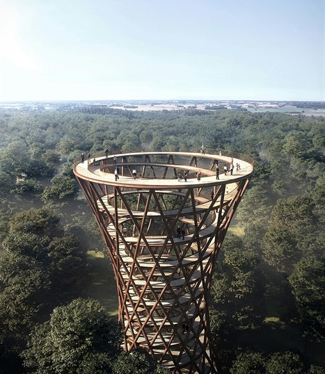
Overlooking the gisselfeld klosters skove forest, south of Copenhagen, EFFEKT’s spiral treetop experience allows visitors to immerse themselves in the stunning danish nature surrounding them. The observation tower is nestled in a luscious forest characterized by a hilly landscape, with several natural elements such as lakes, creeks and wetlands. The 600 meter-long walkway is connected to a 45 meter-tall observation tower, creating a unique opportunity to meander above the trees. both the tower and the walkway function as a seamless and continuous ramp, making the forest accessible for all.
As we said in the “9 graphic design trends you need to be aware of in 2017”, this is the year when we are witnessing a growing desire for counterbalancing the doubt with authenticity and simplicity. And we can see this not just for general graphic design trends, but also for web design, packaging, print design and especially for logo design trends. That said, let’s take a closer look at the logo design trends that define 2017. Some of them are new, other are older trends that confirmed the last year and will become more popular in 2017....
|


Great design resources. Did I mention free?